CSS Test Pages
Demo/test pages of various stylesheets I made. Quality may vary. Now in reverse chronological order for convenience!
All styles are tested in Firefox, so if you have issues in other common browsers like Chrome, please feel free to let me know, and I'll see what I can do.
Please keep in mind these stylesheets are provided as-is and come with ABSOLUTELY NO WARRANTY OF ANY KIND. I may update or edit them at any time. I make no guarantees of functionality or upkeep, or suitability for any particular purpose. What you see is what you get.
If you are having trouble figuring out how to use a stylesheet on your own site, this tutorial might be helpful.
Current Templates
Feel free to use this code as a base for your own stuff. Credit is very much appreciated! ^u^
Styles are listed in reverse chronological order. Entries marked with an 'M' are responsive for mobile, and entries with an 'S' offer a simpler 'base' style and multiple premade skins.
- Noodle Soup Times (M)
- Tabbed (M)
- Neo 3-Column (M)
- Slightly Fancy (M)
- Fixed Header (M)
- HTML CYOA (M)
- Fanlisty (M)
- Busy Generic (M) (S)
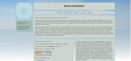
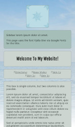
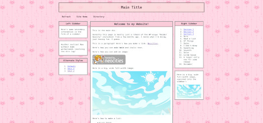
- 3 Column 2.0 (M?) (S)
- Webcomic CSS (M?)
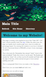
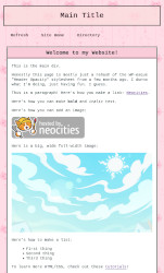
- Fake WP 2 (M) (S)
- ~~garbage~~
- Transparent Glow (M)
- Solid Shadow (M)
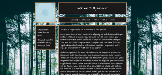
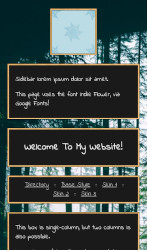
- Dark Header (M)
- Tall Sidebar + Image
- Animesque
- Old Site Style
- Jade 2.0
- Jade 1.0
Noodle Soup Times
This style is mobile friendly!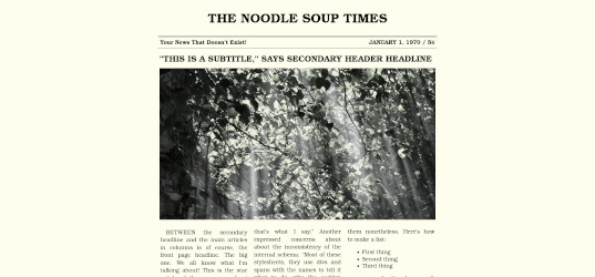
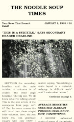
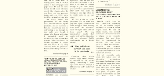
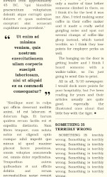
A style meant to look like a fake newspaper. Features include a multi-column layout, fancy blockquotes, and greyscale images that become slightly less greyscale when hovered on.
Tabbed (Light/Dark)
This style is mobile friendly!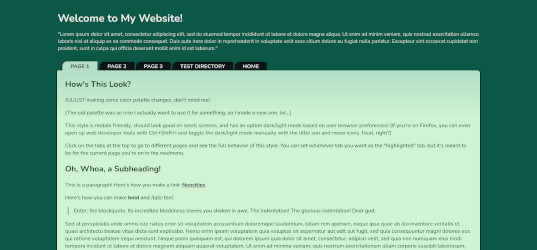
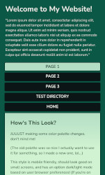
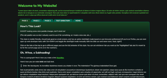
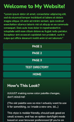
A style with little folder 'tabs' at the top of the content box for the navigation links, which can be styled to highlight the current page's link. Also has a light/dark mode which is applied automatically based on browser preference settings.
Neo 3-Column
This style is mobile friendly!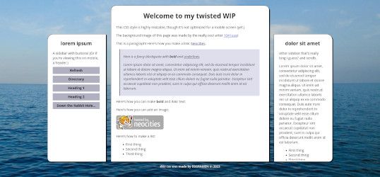
A revamp of an old three-column style, now cooler looking, responsively resizable, and mobile compatible.
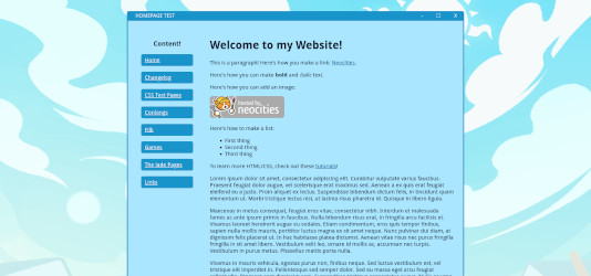
Slightly Fancy
This style is mobile friendly!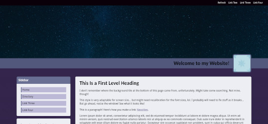
Has a header image, profile pic, sidebar with styled links and titles, sticky top navigation bar, subtle gradiented background, and a footer section with columns.
Fixed Header
This style is mobile friendly!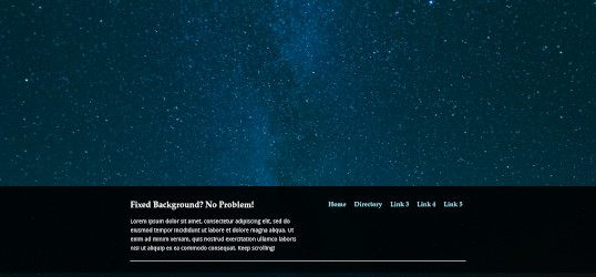
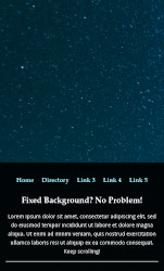
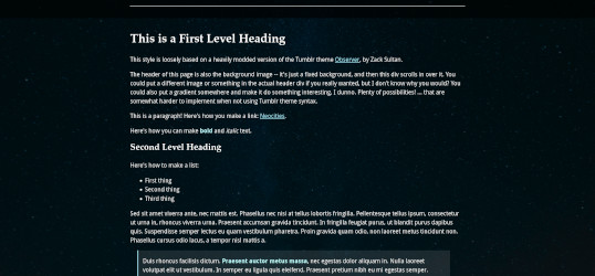
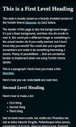
Has a fixed-position header image that the main div "slides" over, a two-column nav layout, a footer, and some basic fancy styling on various elements.
Choose Your Own Adventure: HTML CYOA
This style is (more or less) mobile friendly!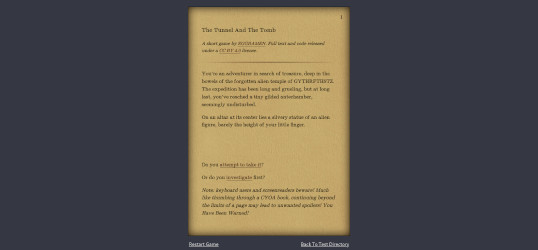
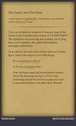
A stylesheet designed for simple Choose Your Own Adventure games, written entirely in plain old CSS and HTML.
Fanlisty
This style is mobile friendly!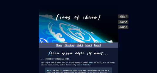
A slightly fancier style based on some fanlistings, shrines, and old web sites I've seen around, with a slightly greater range of fonts and detail -- custom styling is used for headings 1-3, blockquotes, italics, and bold, in addition to the usual styling of links.
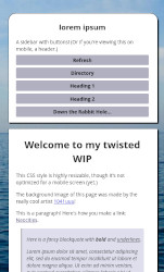
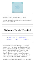
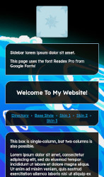
Busy Generic
This code is mobile friendly!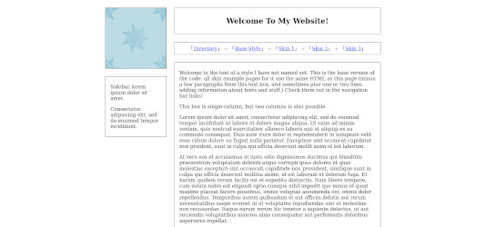
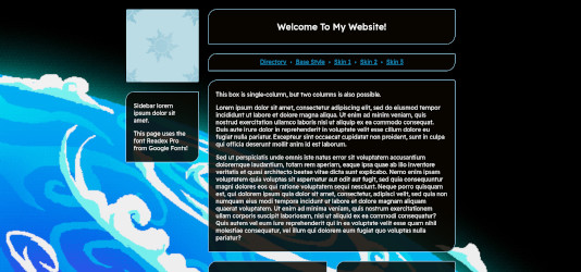
Live Previews: Base | Skin #1: "See Through Blue" | Skin #2: "Chalkboard" | Skin #3: "Almost Deviant"
Stylesheets: Base | Skin #1 | Skin #2 | Skin #3
A layout with a title, navbar links, sidebar, corner/sidebar image, optional single-column or two-column main content section, and footer. Now mobile and small-screen friendly, thanks to calc() and media queries!
Rather than code the whole thing with one look, I've made a (rather ugly) base, and then several example skins. To use a skin, you'll need both the base code and the skin code, and to include both (first the base, then the skin) on the pages that use it.
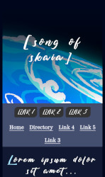
Three Column 2.0
This code is (mostly) mobile friendly!


Live Previews: Base | Skin #1: "I don't have a name just bear with me" | Skin #1.5: Darkmode Variant* | Skin #2: "Cool Blue" | Skin #3: "Yuletide"
Stylesheets: Base | Skin #1 | Skin #1.5 | Skin #2 | Skin #3
A layout with boxes of content in columns and a solid footer at the bottom of the page. Potentially good for a blog or similar arrangement.
This style is intended for heavy customization, so rather than code the whole thing with one look, I've made a (rather ugly) base, and then several example skins. To use a skin, you'll need both the base code and the skin code, and to include both (first the base, then the skin) on the pages that use it.
*Not a full skin, but piggybacks onto Skin 1 the way the other skins do with the base code.
Webcomic CSS
This code is (mostly) mobile friendly!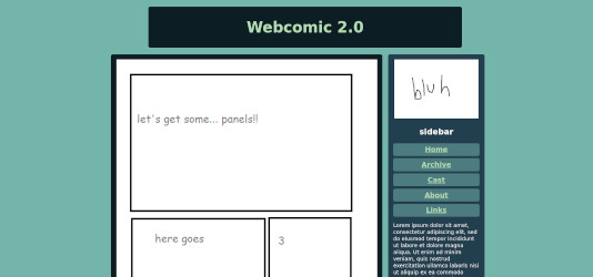
A style designed for webcomics, meant to be useable even on a static site like Neocities with minimal extra work to update. Meant to be reminiscent of Hiveworks layouts, with a header, pagination, author commentary space, sidebar with links, description, and room for widgets. Includes instructions. Hopefully useful.
It's meant to be mobile friendly, but it's been a little janky. Still working out the bugs.
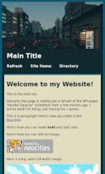
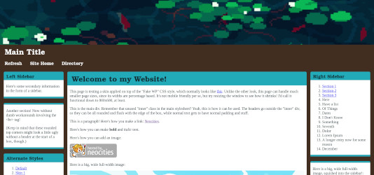
Fake WP 2
This code should now be mobile friendly!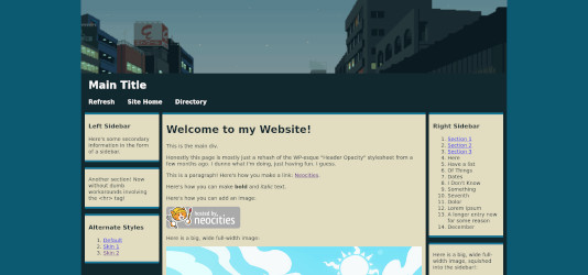
Live Previews: Default | Skin #1: "Full Width And Fancier" | Skin #1: "Small, Pink, And Cutesy"
Stylesheets: Default | Skin #1 | Skin #2
Roughly what it says on the tin. It's basically a blog style. Three-column layout with a main section and two sidebars, plus a top header with links, and header and footer images.
This stylesheet has been modified twice now! It is now significantly more responsive to resizing and can be viewed decently on mobile. If for whatever reason you want the old version with the <hr> tag dividers, the code is here, and the demo page is here. Or, if you want the nice-but-not-mobile-compatible version, the base code is here and you can view the demo here.
If you're using v2 of this style, and you'd like to "update": you should be able to just copy in the @media queries from the end of the base and skin stylesheets and paste them in at the bottom of your own. However, if you've modified any sizes/widths/etc, you'll probably need to spend some time fiddling with the new code to make it look right. Also, if you want the main content div to show up first in the vertical/mobile layout ordering, you will have to rearrange the order of your divs manually. (That, or use flexbox.)
~~garbage~~
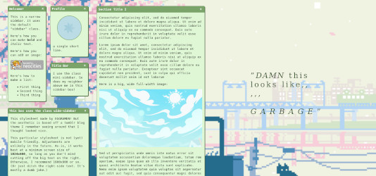
Loosely based off of a tumblr layout I saw ages ago and thought was cool. Has message-box style boxes with subject line and 'X' in corners, a fixed sidebar made of way too many random little boxes, circular profile pics, and an optional big quote side section taking up half the page.
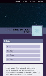
Transparent Glow
This code is mobile friendly!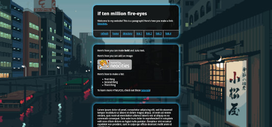
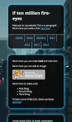
Centered layout with image background, transparent boxes with a "glow" effect, and a designated space for links under the header section.
Solid Shadow
This code is mobile friendly!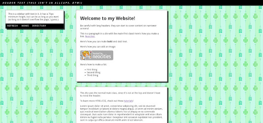
Has a sidebar with space for a few short links, and a fixed header similar to Sticky Header. Boxes have a solid semi-transparent shadow.
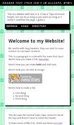
Dark Header
This code is mobile friendly!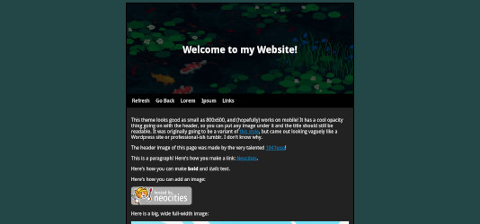
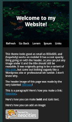
Originally a variant on the Animesque stylesheet, with similar layout, but the header text is overlaid onto the header image along with a dark transparent overlay. Also it's mobile friendly.
Tall Sidebar With Image
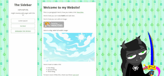
Image background, full-height sidebar, and styling for nice buttons... plus an image on the side of the page that actually works now, and even resizes for smaller screens.
Eventually became the base for the current version of the Jade Pages code.
Animesque
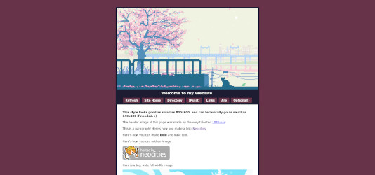
Live Preview #1 | Live Preview #2 | Stylesheet
Based loosely on some old anime fansite layout or another I dimly remembered and tried to recreate. Good down to 800x600, has a header image and title + optional link buttons, and a nice little footer at the bottom of a page.
Old Site Style, Version 3: "questerpest beta"
An older version of my 2021-22 site style. Not great, but not totally awful either, I think. Semi-decent looking window boxes, a button sidebar, footers. Y'know.
Jade 2.0
An improvement over Jade 1.0, if still a bit sketchy. Has a full-height sidebar, nicer buttons in two columns (badly coded because I didn't know the columns option existed), code for a character profile with a picture and infobox, very rudimentary fanfiction listing code (colored text for ratings!), and technically little floating labels for divs? (I never used those, lol.)
Fair warning, the sidebar resizes really weirdly sometimes, and the button columns are way overcomplicated. I revamped it for a reason.
Jade 1.0
The first style used for the Jade Pages. Single column. Some floating buttons. Honestly, I don't recommend this one.
Old Styles & Generic Stuff
Older stylesheets, mostly generic and of lower quality, which I removed from the main listings because they didn't feel worth including. Listed in chronological order. Some of them are really just here for posterity.
Do whatever you want with these; I don't really care.
Soft Pink (stylesheet)
Just some simple boxes with percentage-based margins and fixed-width text (for some reason.)
Hamsteak (stylesheet)
Literally just a grey box and monospace font. Ugly.
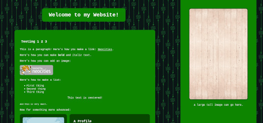
Wooden (stylesheet)
Brown boxes, fixed tiled background. Why.
Soft Blue (stylesheet)
The pink one, but blue.
Webcomic CSS 1.0 (stylesheet)
Older, crappier version of the Webcomic CSS above.
Scroll Central (stylesheet)
A central box that scrolls. Uses a google font embed.
Sidebars and Scrollboxes (stylesheet)
Scrolling box and scrolling sidebar. Uses a google font embed.
Sweet (stylesheet)
Some slightly nicer looking single-column boxes with fancier borders, and a fullsize image background.
Another Sidebar (stylesheet)
Baby's first proper floating sidebar. Has support for preventing image overflow, too.
Simple (stylesheet)
A very simple, slightly minimalist box style with lots of padding. Options include a fixed-height scrolling box or long box, and if desired, a box shaped like a circle.
Sticky Header (stylesheet)
A basic style with a header that sticks to the top of the page. Mobile friendly.
Three Columns (stylesheet)
A not-so-great three column layout. Was retired for a while but I'm adding it back here for posterity. If you want a better version of this, try Neo 3-Column.
Old Site Style Version 1: "Powder Blue Sun": My first real site CSS from 2019. More complex than the others here, but honestly, 2/10, would not recommend. Past me couldn't even center a div, and it showed.